Visualizations and Insights
Here are our embedded visualizations and our insights for each visualization:
This visualization shows how California, Texas, and New York have the highest population out of all states. You can see that the states in Mountain West have the lowest population. This population graph shows how states along the water tend to have higher populations on average.
From 1999 to 2017, California had over 8 million total deaths from the ten leading causes of death. The total number of deaths per state is very correlated to the population of the states. States with the least population size have the least total number of deaths.
You can see that Colorado, California, and Texas have the highest total deaths from Alzheimer's disease in 2017. You can see that Alaska, District of Colombia, and Wyoming had the lowest number of total deaths from Alzheimer's disease. The total number of deaths are strongly correlated to the population of each state, which makes it hard to analyze.
You can see that only heart disease and cancer are the leading causes of deaths across each state in 2017. For some states, heart disease is the leading cause of death in 2017 and for other states, cancer is the leading cause of death in 2017. There are more states with heart disease as the leading cause of than states with cancer as the leading cause of death.
You can see that heart disease and cancer make up approximately 50% of death causes across every state. Suicide and kidney disease are the smallest two out of the top 10 leading causes of death. Every state has a fairly similar proportion between all leading causes of death.
All top 10 states have a fairly similar proportion between all ten leading causes of states. There are not many glaring insights from this graph since the states with the larger bars are just states that have a larger population. We learned that we must factor in the population of every state in order to find more insightful conclusions.
Indiana seems to follow a similar proportion of leading causes of death as other states in the Midwest. All states in the Midwest seem to follow a similar proportion of leading causes of death, when taking into account population differences. Ohio has the most total number of deaths in 2017 out of all states in the Midwest.
New York seems to follow a similar proportion of leading causes of death as other states in the Northeast. All states in the Northeast seem to follow a similar proportion of leading causes of death, when taking into account population differences. New York has the most total number of deaths in 2017 out of all states in the Northeast. Vermont has the least total number of deaths in 2017 out of all states in the Northeast.

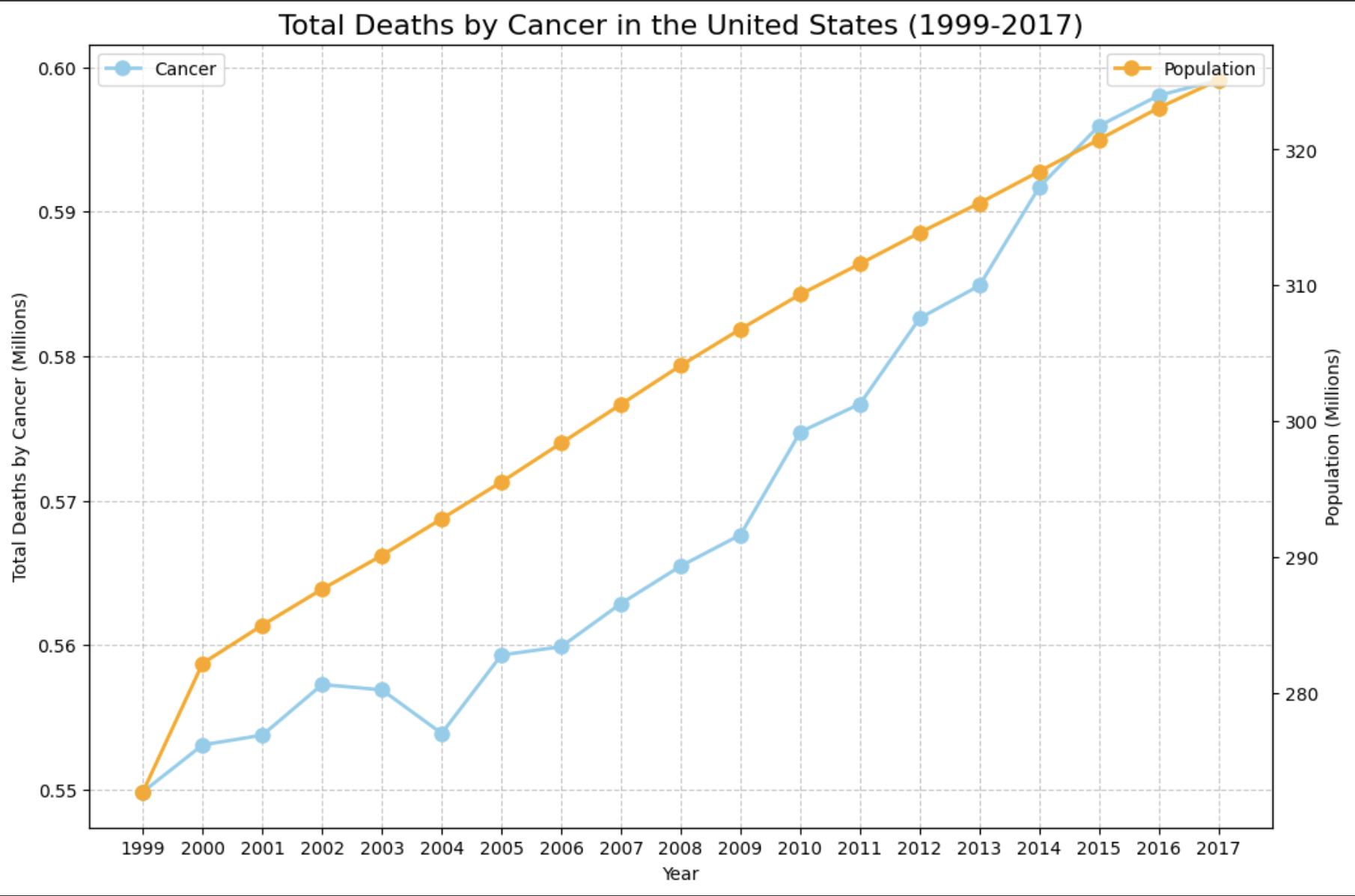
Starting in 2004, the total deaths from cancer in the United States has outpaced the annual percentage rise in U.S. population. From 2015 to 2017, the annual rate of total deaths by cancer and population across the United States has grown at the same rate. From 1999 to 2004, the total number of deaths from cancer remained relatively flat.
In 2017, California had the greatest number of deaths from cancer at 59,516 people. States in the Mountain West had the least number of deaths from cancer in 2017, primarily due to a lower population. It is crucial to analyze deaths from cancer in a per capita basis so that our insights are not skewed by the population of each state.
From 2010 to 2014, there was an overall decrease in the average number of people killed by heart diseases in New York. In 2010, there were the most number of people killed by heart disease in New York out of any year from 2010 to 2017. This may be due to better technology to prevent heart disease deaths. There was an increase of over 1.5k deaths in heart disease deaths from 2014 to 2015.

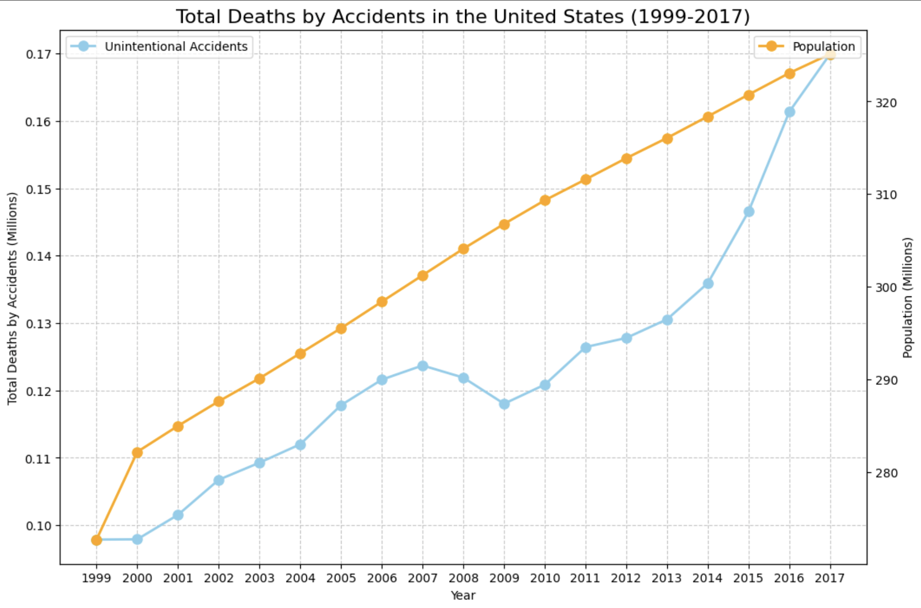
Starting in 2009, the total deaths from accidents in the United States has outpaced the annual percentage rise in U.S. population. From 1999 to 2007, the percentage increase in the total number of deaths from accidents and the increase in the population in the U.S. tracked each other very well. There may be another factor causing this unprecedented rise in the deaths from accidents.
California, Florida, and Texas had the highest total number of deaths from accidents from 1999 to 2017. This is primarily due to the fact that these states have larger populations. Wyoming, Vermont, D.C., and North Dakota have the lowest total number of deaths from accidents from 1999 to 2017. There does not seem to be any massive outliers for states with a lower population size that have a high number of deaths from accidents.
The state of Nevada has a higher age-adjusted death rate than the U.S. as a whole in cancer and heart disease. The state of Nevada has a lower age-adjusted death rate than the U.S. as a whole in kidney disease, diabetes, stroke, and Alzheimer's disease. As seen in the all causes bars, Nevada has a higher age-adjusted death rate than the United States average. This type of analysis can be done for every state to see how they compare to the United States across all death types.
In 2017, heart disease was the leading cause of death in the United States. The second leading cause of death in the United States was cancer. Unintentional injuries are the 3rd leading cause of death in the United States in 2017.
We can see that West Virginia has the largest ratio of all causes deaths to population. We can see that Utah and Alaska have the largest ratio of all causes deaths to population. There does not seem to be a correlation between states with higher populations and deaths per capita.
California has the smallest ratio of deaths per capita for unintentional injuries. Deaths for unintentional injuries per capita is the largest in West Virginia. 29.2% of Utah's population is children aged 0-18 which would lower their death rate per capita. Utah also has the lowest number of adults aged 65+ in the United States at 12.0%. West Virginia has 21.4% of their population aged 65 or older, which could be a factor for their high death rate per capita. By factoring in population, we can compare across all states in an unbiased manner.
We can see that West Virginia stands out as the state with the highest death rate from all causes per capita. We can see that Utah stands out as the state with the lowest death rate from all causes per capita. We can see that southern states seem to have a higher death rate from all causes per capita compared to western states.
The 5 states on the left are the states that spend the least per capita on healthcare spending and the 5 states on the right are the states that spend the most per capita on healthcare spending. There does not seem to be a correlation between healthcare spending per capita and total number of deaths per capita. This can be because states with more need for healthcare spending spend more to lower the number of deaths. There may be other factors that impact the death rate per capita than healthcare spending.
The 5 states on the left are the states that have the lowest median age and the 5 states on the right are the states that have the highest median age. There does seem to be a correlation between lower median age in the state and lower deaths per capita. This can be because states with a lower median age will have less health complications. Utah spends the least per capita in hospital care and physician/clinical services out of every single state (This may be because they have less health complications due to a younger population). West Virginia has the 3rd oldest population, which could be a reason they have the highest ratio of deaths per capita.
Utah, Colorado, Washington, and Vermont have the least inactivity prevalence out of all of the states. This chart looks very similar to the heart disease deaths per capita in each state visualization States with a lower inactivity prevalence may have lower overall death rates due to the positive impact of exercise on health. Mississippi has the highest inactivity prevalence percentage out of all states.
Southern states have seemingly higher deaths per capita from heart disease. Utah, a young state in terms of average age, has very low per capita deaths from heart disease. Western states seem to have a lower ratio of heart disease deaths per capita than the rest of the United States. This can be contributed to age demographics and inactivity prevalences in the other charts.
We can see that West Virginia has the highest ratio of chronic lower respiratory deaths per capita than other states in the United States. We can see that Utah has the lowest ratio of chronic lower respiratory deaths per capita than other states in the United States. Oklahoma, Kentucky, and West Virginia have the top 3 highest ratios of chronic lower respiratory deaths per capita in the United States.
Montana has the highest suicide ratio per capita in the United States. New York, New Jersey, Massachussetts, and California have the lowest suicide death rate per capita in the United States. Southeast states tend to have a lower suicide death rate per capita than northwest states.
Hawaii is the 9th oldest state on average in the United States. In Hawaii, because of their high volume tourism and tropical climates, they experience flu year round, which leads to their super high death rate per capita from the flu and pneumonia. The ten most populated states (California, Texas, Florida, New York, Pennsylvania, Illinois, Ohio, Georgia, North Carolina, and Michigan) are not outliers in the data set. Most states have a similar ratio of influenza/pneumonia deaths to populations. Close contact in more heavily populated states does not appear to be a determining factor for more infleunza deaths per person.